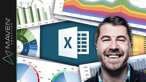
Microsoft Excel: Data Visualization, Excel Charts & Graphs
Loại khoá học: Tin học văn phòng
Master 20+ Excel charts, build advanced Excel visuals & learn data analysis with a best-selling Excel instructor!
Mô tả
Excel is an incredibly powerful and dynamic data visualization platform for those willing to think beyond rows, columns, and primitive pie charts, and I'm here to prove it.
This course gives you a deep, 100% comprehensive understanding of Excel's latest data visualization tools and techniques. I'll show you WHEN, WHY, and HOW to use each Excel chart type, introduce key data visualization best practices, and guide you through interactive, hands-on demos and Excel exercises every step of the way.
We'll kick things off by exploring each of the 20+ charts & graphs in Excel, including:
Bar & Column charts
Histograms & Pareto charts (Office 365, Excel 2016 or Excel 2019)
Line charts, Area charts & trend lines
Pies & Donuts
Scatter plots & Bubble charts
Box & Whisker charts (Office 365, Excel 2016 or Excel 2019)
Tree Maps & Sunbursts (Office 365, Excel 2016 or Excel 2019)
Waterfall & Funnel charts (Office 365, Excel 2016 or Excel 2019)
Radar & Stock charts
Heat maps, 3-D Surface & Contour charts
Choropleths & Geospatial maps
Custom Combo Charts
Sparklines
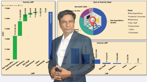
From there we'll dive into a series of 12+ advanced Excel demos guaranteed to turn you into an absolute data viz rockstar. These aren't "textbook" demos that you can find on Excel YouTube channels; these are projects adapted from actual, award-winning work featured by Microsoft, MIT, and the New York Times. I've built my analytics career around data visualization, and I can help you do the same.
We'll cover advanced Excel data viz topics that you won't find anywhere else, including:
Custom image overlay charts
Automation with named ranges and OFFSET/COUNTA functions
Scroll & Zoom functionality with Excel form controls
Animated charts to visualize changes over time
Dynamic, custom Excel dashboards
Value-based chart formatting
Custom gauge charts & pacing charts
Grid visuals using Excel array formulas
Whether you're looking for a quick primer, trying to diversify your Excel skill set, or hoping to step up your Excel data visualization game in a major way, this course is for you.
See you there!
-Chris (Founder, Maven Analytics)
Looking for the full business intelligence stack? Search for "Maven Analytics" to browse our full course library, including Excel, Power BI, MySQL, Python and Tableau courses!
Hear why this is one of the TOP-RATED Excel courses on Udemy, and the #1 Excel Data Visualization course:
"Absolutely great stuff. I really enjoyed it! Chris is truly a Excel guru. I strongly recommend this course to all users looking to improve their skills with Excel charts & graphs."
Nirav M.
"Excellent from start to finish! I picked up a bunch of Excel data visualization tips that will be useful in the workplace, including some very cool advanced Excel visuals and custom charts & graphs. Loved all of it, and hope I can learn more from this wonderful individual!"
Robert C.
"At the first part I just said to myself, "Wow, Excel is capable of that? It's amazing!" Then at the second part I told myself "This guy is doing magic!", and now I feel like I'm capable of doing the same. I'm definitely buying his other Excel and data visualization courses!"
Judit B.
NOTE: Full course includes downloadable resources and Excel project files, homework and course quizzes, lifetime access and a 30-day money-back guarantee. Most lectures compatible with Excel 2016, Excel 2019 or Office 365.
Bạn sẽ học được gì
Yêu cầu
Nội dung khoá học
Viết Bình Luận
Khoá học liên quan
_m_1623212344.jpg)


Đăng ký get khoá học Udemy - Unica - Gitiho giá chỉ 50k!
Get khoá học giá rẻ ngay trước khi bị fix.
Đánh giá của học viên
Bình luận khách hàng