Responsive UX/UI Design in Figma 2h deep dive JULY 23 UPDATE
Loại khoá học: User Experience Design
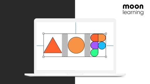
Figma Auto Layout, Constraints and Breakpoints: Responsive setup, testing and design documentation, min/max width, wrap
Mô tả
Auto layout driving you crazy? Scared about what will happen with your design in the browser? Then this class is just right for you.
We will learn everything about how to set up responsive UI design with Figma. This will be a real deep dive into constraints, auto layout, and most important but rarely discussed breakpoints for your UI Design. Combining those tools will allow us to really test and document your designs and components in line with the actual code settings.
We will start with constraints:
What constraints in Figma are
How to apply them correctly
How they are a total lifesaver when it comes to working with grids
Did you know you can combine constraints and auto layout?
Being aware of limitations
Deep dive into auto layout:
Auto layout update during Config 2023 overview NEW
What is auto layout?
How and where to apply auto layout
Understanding the auto layout menu
Spacing and stacking
Build a responsive card and learn about the power of resizing
Play with the mighty power of nested auto layout frames
Absolute positioning
Create more complex card setups
Padding and spacing with variables NEW
Setting min/max width NEW
auto layout wrap NEW
Setting up an entire auto layout page NEW
Set up an entire page in auto layout
Learn about different stacking options
Fixed aspect ratio with images
Minimum width hack
Slot components
We will then learn how to deal with breakpoints in Figma:
What are they
How do components and pages adapt?
How do breakpoints and media queries work in CSS
Which breakpoint values should I use for my design
How to set up breakpoints in Figma
How to test pages and components with breakpoints
Documenting the findings
Figma breakpoints plugin
A word about responsive typography
With the course material file, you can work alongside me or return to exercises with detailed instructions in your own time.
This class is right for you if you have basic knowledge of Figma or if you are an advanced Figam user and really want to brush up on your skills.
NOTE: This is a UI Design class in Figma. We will NOT set up responsive development in code!
Bạn sẽ học được gì
Auto Layout
Constraints
Testing responsive components with Breakpoints
Documenting responsive components and pages
Absolute positioning
Fix aspect ratio
Auto layout resizing
How to find the right breakpoints and translate them to Figma
How to media queries work under the hood in CSS
Breakpoint Plugin
Note: We will NOT deal with coding responsive web!
Figma working material file with plenty of exercises
Access to the moonlearning student files library
Yêu cầu
- We start at 0 with responsive design, but you should have basic Figma knowledge
- You need access to a (free) Figma account
Nội dung khoá học
Viết Bình Luận
Khoá học liên quan


Đăng ký get khoá học Udemy - Unica - Gitiho giá chỉ 50k!
Get khoá học giá rẻ ngay trước khi bị fix.
Đánh giá của học viên
Bình luận khách hàng